A recent article in the Chronicle of Higher Education pointed out the things colleges are doing to bolster their yield rates. This of course, raised an interesting question among many outside of higher education: What's a yield rate?
Colleges admit many more students than they want to enroll, of course. But let's say you want to enroll a class of 1,000. How many, exactly, do you need to admit? Most of the students you admit will have more offers than the ones you send, and they can only enroll in one place. So, if you admit 2,000, you need exactly half of them to enroll, which would mean a yield rate of 50%. If you're not confident you can get that kind of yield, you admit more: 2,500 with a 40% yield rate gets you that same number (40% of 2,500). But with most institutions, yield rates are closer to 30%, so that means 3,333. Or thereabouts.
Alas, many colleges are afraid of that admit rate (the percentage of applicants admitted) getting too high, because for many parents and students, a low admission rate is a proxy for quality: An admit rate of 15% means (to some) that an institution is better than one with an admit rate of 30%. And so on. Part of what they do is generate "softer" applications, via a variety of methods I've talked about many times, ad nauseam. But the problem is that you don't know precisely who a soft app is, so you can't just take the same number of students, because the soft apps (with lower propensity to yield) will bring down your yield rate. So admit rates fall, but ultimately, so do yield rates.
Managing and reviewing more applications is expensive, and if you care greatly about that admit rate, you try to keep it as low as possible and still make your class, by raising the yield. Looking at demonstrated interest is one way; using financial aid more strategically is another; and finally, good old fashioned tactical approaches are another still. Many places use all three.
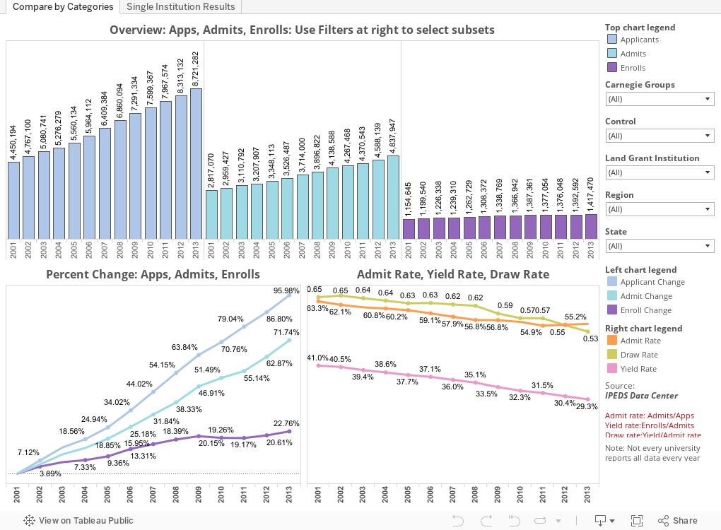
Here is what our wheel spinning and tail chasing has spawned: Thirteen years of increasing applications, increasing admit rates, and decreasing yield and draw rates (draw is a better measure of market position vis-a-vis competitors because it punishes you if you try to appear more selective at the price of yield).
The first view here shows colleges in groups, starting with all 1,432 public and private not-for-profit, four-year, degree granting colleges in the US that admit freshmen in the traditional Carnegie classifications (Baccalaureate, Master's and Doctoral, excluding Baccalaureate-Associates colleges). You can use the filters to look at any combination of variables you'd like to see how things have changed.
The second view (using the tab across the top) allows you to use the filter to select any single college. And, if you're like most people, the first ones you select will be the big names, who trends appear to move in the opposite direction of the industry as a whole. Which means, that for all those institutions trying to look like they're in the RBL (REALLY Big Leagues), all your effort has put you farther behind.
What do you see? Leave a comment below.
Colleges admit many more students than they want to enroll, of course. But let's say you want to enroll a class of 1,000. How many, exactly, do you need to admit? Most of the students you admit will have more offers than the ones you send, and they can only enroll in one place. So, if you admit 2,000, you need exactly half of them to enroll, which would mean a yield rate of 50%. If you're not confident you can get that kind of yield, you admit more: 2,500 with a 40% yield rate gets you that same number (40% of 2,500). But with most institutions, yield rates are closer to 30%, so that means 3,333. Or thereabouts.
Alas, many colleges are afraid of that admit rate (the percentage of applicants admitted) getting too high, because for many parents and students, a low admission rate is a proxy for quality: An admit rate of 15% means (to some) that an institution is better than one with an admit rate of 30%. And so on. Part of what they do is generate "softer" applications, via a variety of methods I've talked about many times, ad nauseam. But the problem is that you don't know precisely who a soft app is, so you can't just take the same number of students, because the soft apps (with lower propensity to yield) will bring down your yield rate. So admit rates fall, but ultimately, so do yield rates.
Managing and reviewing more applications is expensive, and if you care greatly about that admit rate, you try to keep it as low as possible and still make your class, by raising the yield. Looking at demonstrated interest is one way; using financial aid more strategically is another; and finally, good old fashioned tactical approaches are another still. Many places use all three.
Here is what our wheel spinning and tail chasing has spawned: Thirteen years of increasing applications, increasing admit rates, and decreasing yield and draw rates (draw is a better measure of market position vis-a-vis competitors because it punishes you if you try to appear more selective at the price of yield).
The first view here shows colleges in groups, starting with all 1,432 public and private not-for-profit, four-year, degree granting colleges in the US that admit freshmen in the traditional Carnegie classifications (Baccalaureate, Master's and Doctoral, excluding Baccalaureate-Associates colleges). You can use the filters to look at any combination of variables you'd like to see how things have changed.
The second view (using the tab across the top) allows you to use the filter to select any single college. And, if you're like most people, the first ones you select will be the big names, who trends appear to move in the opposite direction of the industry as a whole. Which means, that for all those institutions trying to look like they're in the RBL (REALLY Big Leagues), all your effort has put you farther behind.
What do you see? Leave a comment below.
Comments
Post a Comment