Diversity is a topic a lot of us in higher education think about and write about and work towards, and yet, we don't really have a common definition of what it means. At its most basic level, we simply talk about the percentage of our students who are non-white. And, of course, if you compare colleges today to those in the 1950's, this makes perfect sense, and allows us to give ourselves all a pat on the back.
But the success of Asian students over the past few decades has complicated this: While they are not white, their large numbers at the nation's most selective institutions, and performance on college admissions examinations, makes us occasionally shift the discussion to under-represented students of color, which today might include Native American and Alaska Natives, Latino or Hispanic students, African-American students, Asians who are Hawaiian or Pacific Islander, and students of two or more races or ethnicity. This of course causes us to wonder whether a student of mixed Asian/Caucasian ethnicity should count, and to remember that technically, Hispanic is not a race. It's all very confusing.
On top of that, there are institutions who serve large numbers of under-represented students (HBCUs, for instance) that are not very diverse in the clinical sense: Almost everyone enrolled in those institutions are African-American. How do we think about decribing diversity that makes sense to everyone?
One way to do it is to use a measure called Simpson's Diversity Index. You can read about it here if you'd like, but it essentially says that once you come up with a category and count the population, you can calculate the likelihood that choosing any two members at random presents a mismatch of type. For instance, at a college in Puerto Rico, if you randomly select two students, the chances they are of different ethnicities is probably very small: You'll usually get two Hispanic students. Go to Howard University, and odds are you'll select two African-American students on your trials. This translates into a lower Simpson's number. If you have a university that is truly more diverse in the ecological sense, you'll see that number go up. All the numbers in the index are between zero and one.
Of course, it's short-sighted to measure diversity just on race or ethnicity, but it's the thing we have the best data on. We can add other elements into the mix, but since the data are pre-aggregated, we cannot break the groups into subgroups (for instance, wealthy White students vs. poor White students.) This would yield better insight.
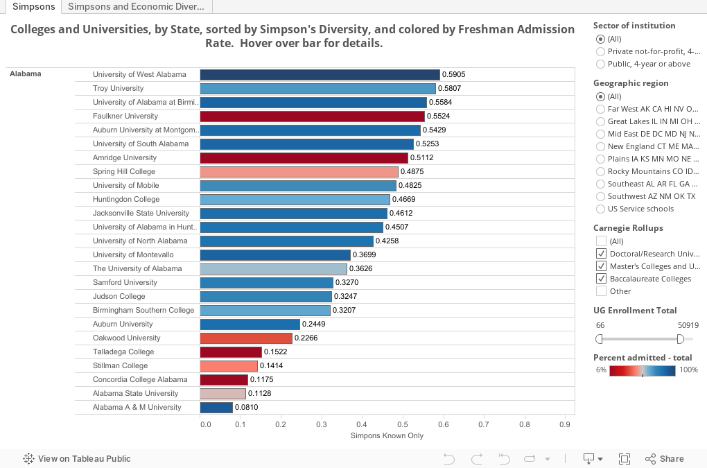
Look below. The first view shows all four-year, public and private not-for-profit colleges and universities in the US, and their Simpson's Diversity Index as calculated from total undergradute enrollment in 2013 Fall. On the first view, the bars are colored by freshman admissions rate, with an interesting theory suggesting that if your admit rate is low, you could be more diverse if you really wanted to be. In the tool tip that pops up when you hover over a bar (like in the screenshot right below), you'll see the breakdown of enrollment by ethnicity.

And if you hover over several bars in the same range, you'll see you can get to similar numbers in very different ways. So, even among diverse institutions, there are very different student body mixes in play.
On the second tab, you'll see some element of economic diversity added in: Pell Grant eligibility as a color. The chart is a scatter of Simpson's and Admission rates.
One note: I calculated the index two ways, using as the base number only those with known ethnicity, and then those whose ethnicity was not listed. I think the first number is probably a better tool, but I did include it the second in the tool if you're interested.
Do you see anything interesting here? I'd love to hear it.
But the success of Asian students over the past few decades has complicated this: While they are not white, their large numbers at the nation's most selective institutions, and performance on college admissions examinations, makes us occasionally shift the discussion to under-represented students of color, which today might include Native American and Alaska Natives, Latino or Hispanic students, African-American students, Asians who are Hawaiian or Pacific Islander, and students of two or more races or ethnicity. This of course causes us to wonder whether a student of mixed Asian/Caucasian ethnicity should count, and to remember that technically, Hispanic is not a race. It's all very confusing.
On top of that, there are institutions who serve large numbers of under-represented students (HBCUs, for instance) that are not very diverse in the clinical sense: Almost everyone enrolled in those institutions are African-American. How do we think about decribing diversity that makes sense to everyone?
One way to do it is to use a measure called Simpson's Diversity Index. You can read about it here if you'd like, but it essentially says that once you come up with a category and count the population, you can calculate the likelihood that choosing any two members at random presents a mismatch of type. For instance, at a college in Puerto Rico, if you randomly select two students, the chances they are of different ethnicities is probably very small: You'll usually get two Hispanic students. Go to Howard University, and odds are you'll select two African-American students on your trials. This translates into a lower Simpson's number. If you have a university that is truly more diverse in the ecological sense, you'll see that number go up. All the numbers in the index are between zero and one.
Of course, it's short-sighted to measure diversity just on race or ethnicity, but it's the thing we have the best data on. We can add other elements into the mix, but since the data are pre-aggregated, we cannot break the groups into subgroups (for instance, wealthy White students vs. poor White students.) This would yield better insight.
Look below. The first view shows all four-year, public and private not-for-profit colleges and universities in the US, and their Simpson's Diversity Index as calculated from total undergradute enrollment in 2013 Fall. On the first view, the bars are colored by freshman admissions rate, with an interesting theory suggesting that if your admit rate is low, you could be more diverse if you really wanted to be. In the tool tip that pops up when you hover over a bar (like in the screenshot right below), you'll see the breakdown of enrollment by ethnicity.
And if you hover over several bars in the same range, you'll see you can get to similar numbers in very different ways. So, even among diverse institutions, there are very different student body mixes in play.
On the second tab, you'll see some element of economic diversity added in: Pell Grant eligibility as a color. The chart is a scatter of Simpson's and Admission rates.
One note: I calculated the index two ways, using as the base number only those with known ethnicity, and then those whose ethnicity was not listed. I think the first number is probably a better tool, but I did include it the second in the tool if you're interested.
Do you see anything interesting here? I'd love to hear it.
Comments
Post a Comment