Previously, I did an analysis of colleges, showing which states freshmen came from in 2012. It was very popular with people who are interested in the topic of geographic diversity.
But I heard another admissions person say last week (while I was at Missouri ACAC) that her college wants to enroll more students from outside the state. It's not hard to figure out why: Students who cross borders (or who travel farther to college) are generally wealthier and have parents who are college-educated themselves, both of which make these students attractive targets. Since the number of these students who are likely to migrate is essentially fixed in any given year, the intent to recruit more of them is really an effort to get a bigger piece of the pie.
But some states have naturally stronger pulls; others export more because of a relative lack of opportunity based on a smaller selection of colleges. Where do students in your state come from? Is your state enrolling a lot of students from out of state, or do you send a lot away?
Here is some 2012 IPEDS data for you to look at.
Note:
For instance, hovering over this box on the first view, you'll see that 24.6% of students at colleges in Alabama came from Georgia:

The first (orange and gray) view shows only non-resident students; the second view (with the purple boxes) shows all freshmen. On that one, notice that Iowas enrolls 20% of all freshmen from Illinois. Knock it off, Iowa. Note the diagonal band where each state intersects with itself. And note the range in color on that diagonal.
How attractive is your state, and to which ones? It's an important question to ask before you assume you can swoop into a state and get more students.
But I heard another admissions person say last week (while I was at Missouri ACAC) that her college wants to enroll more students from outside the state. It's not hard to figure out why: Students who cross borders (or who travel farther to college) are generally wealthier and have parents who are college-educated themselves, both of which make these students attractive targets. Since the number of these students who are likely to migrate is essentially fixed in any given year, the intent to recruit more of them is really an effort to get a bigger piece of the pie.
But some states have naturally stronger pulls; others export more because of a relative lack of opportunity based on a smaller selection of colleges. Where do students in your state come from? Is your state enrolling a lot of students from out of state, or do you send a lot away?
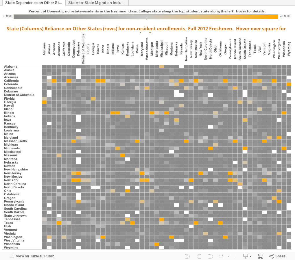
Here is some 2012 IPEDS data for you to look at.
Note:
- There are two views of the data (note the tabs at the top).
- On each of these two views, the columns--that is, the states listed across the top--represent the state where the colleges are located.
- The rows represent the home states of the freshmen (this includes only domestic students, not international students on visas).
- The box is colored by the percentage of students in the college's state that come from the state on the row.
For instance, hovering over this box on the first view, you'll see that 24.6% of students at colleges in Alabama came from Georgia:
The first (orange and gray) view shows only non-resident students; the second view (with the purple boxes) shows all freshmen. On that one, notice that Iowas enrolls 20% of all freshmen from Illinois. Knock it off, Iowa. Note the diagonal band where each state intersects with itself. And note the range in color on that diagonal.
How attractive is your state, and to which ones? It's an important question to ask before you assume you can swoop into a state and get more students.
Comments
Post a Comment