
The Hemingway Version of a Faulkner Story

Note: Tableau Guru Jeffrey Shaffer suggested I change from a red/green palette to one that's better for people who cannot distinguish between those two colors.  I changed it to include one view with orange/purple, but kept the original as well.

My undergraduate degree is in English Literature, and so I've read a lot of things I didn't like. In one American literature class I remember, the two heavyweights of the course were William Faulkner and Ernest Hemingway, and the difference in their literary styles made an impression on me.  I'm reminder of this exchange of criticisms:

Faulkner: "Hemingway has never been known to use a word that might send the reader to a dictionary."
Hemingway: "Poor Faulkner.  Does he really think big emotions come from big words?"

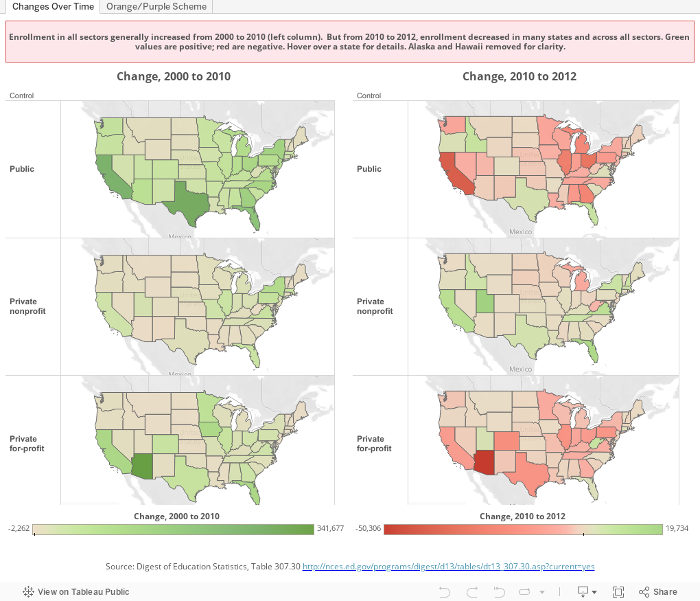
And so it goes with Story Telling With Data.  I downloaded an interesting data table from the Digest of Education Statistics, and worked for a long time, trying to find some interesting way to display the data.  I had a story board with four dashboards, but nothing was telling anything that was compelling. Part of the problem is that the patterns are hidden in the 50 states and three different types of FTE enrollment: Public, Private, and Private For-Profit.

And then it happened, and the charts tell the story almost without words.  On the left is change in FTE (Full-time Equivalent) enrollment by state from 2000 to 2010, broken out by sector.  Notice: Almost every state in all three views are green, showing positive numbers.  The worst is the khaki color, showing low increases.  

In the right column, it's a very different story.  Lots of red, concentrated, interestingly enough, in publics and the for-profit sector.  You can hover over a state for details, but the patterns are pretty clear, even without doing so.

There. A story, with no big words, and just a few pictures.


Comments

Popular posts from this blog

Changes in AP Scores, 2022 to 2024

Used to be, with a little work, you could download very detailed data on AP results from the College Board website: For every state, and for every course, you could see performance by ethnicity.  And, if you wanted to dig really deep, you could break out details by private and public schools, and by grade level.  I used to publish the data every couple of years. Those days are gone.  The transparency The College Board touts as a value seems to have its limits, and I understand this to some extent: Racists loved to twist the data using single-factor analysis, and that's not good for a company who is trying to make business inroads with under-represented communities as they cloak their pursuit of revenue as an altruistic push toward access. They still publish data, but as I wrote about in my last post , it's far less detailed; what's more, what is easily accessible is fairly sterile, and what's more detailed seems to be structured in a way that suggests the company doesn...

Educational Attainment and the Presidential Elections

I've been fascinated for a while by the connection between political leanings and education: The correlation is so strong that I once suggested that perhaps Republicans were so anti-education because, in general, places with a higher percentage of bachelor's degree recipients were more likely to vote for Democrats. The 2024 presidential election puzzled a lot of us in higher education, and perhaps these charts will show you why: We work and probably hang around mostly people with college degrees (or higher).  Our perception is limited. With the 2024 election data just out , I thought I'd take a look at the last three elections and see if the pattern I noticed in 2016 and 2020 held.  Spoiler: It did, mostly. Before you dive into this, a couple of tips: Alaska's data is always reported in a funky way, so just ignore it here.  It's a small state (in population, that is) and it's very red.  It doesn't change the overall trends even if I could figure out how to c...

Changes in SAT Scores after Test-optional

One of the intended consequences of test-optional admission policies at some institutions prior to the COVID-19 pandemic was to raise test scores reported to US News and World Report.  It's rare that you would see a proponent of test-optional admission like me admit that, but to deny it would be foolish. Because I worked at DePaul, which was an early adopter of the approach (at least among large universities), I fielded a lot of calls from colleagues who were considering it, some of whom were explicit in their reasons for doing so.  One person I spoke to came right out at the start of the call: She was only calling, she said, because her provost wanted to know how much they could raise scores if they went test-optional. If I sensed or heard that motivation, I advised people against it.  In those days, the vast majority of students took standardized admission tests like the SAT or ACT, but the percentage of students applying without tests was still relatively small; the ne...