It's the kind of headline that grabs attention: Catholic colleges tell poor students: Go somewhere else. And it certainly generated some discussion on Twitter and within my own university. The article was written by Paul Moses, who is a Journalism Professor at Brooklyn College, and who seems to have a strong interest in social justice and Catholic topics, based on his tweets.
When you work at a Catholic college or university, service to the poor is something you talk about all the time. At my own institution, where about 28% of freshmen receive the Pell Grant, we pride ourselves that the commitment is in our mission statement. So I thought the topic deserved something more than the one-dimensional, high-level examination the article offered.
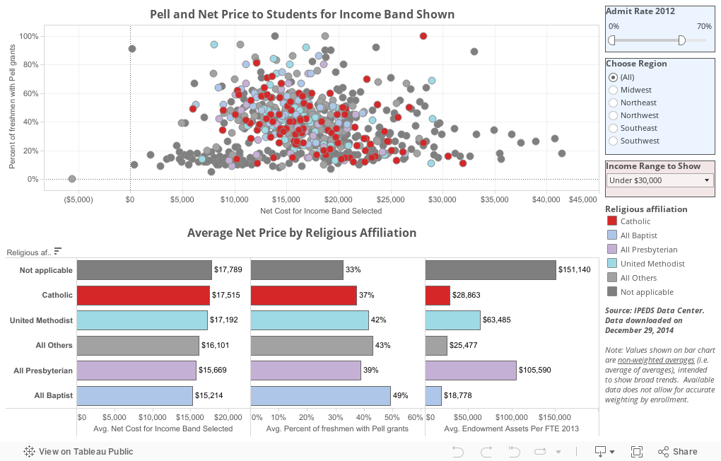
I went to IPEDS and downloaded some data, which is presented here. To start with, I've included only private institutions, filtering to those with admission rates below 70%, as these institutions have some flexibility in shaping the freshman class, which leads to conscious choices about trade-offs other non-selective institutions don't have to make. If you want to change that, just slide the control on the top right to suit your taste. There are 1,283 private institutions in this data set, but not all have complete data; the top view currently shows 658 after filtering, colored by religious affiliation. Hover over a dot for details. Click on the pencil in the legend to highlight one group.
Additionally, I've allowed you to filter by broad geographic region, and I think you'll find this instructive as you dive deeper into the data.
The top scatter gram arrays the institutions on two scales: The x-axis is set to the net price for students with family incomes of $30,000 or less. Using the control in the pink box, you can change that. The y-axis shows the percent of freshmen with Pell Grants, the grant for the neediest students in the country (usually with family incomes below $50,000.)
The bottom chart shows three views, and uses the same filters as the top view, but aggregates them to show the data by religious affiliation. Note that because the data are limited, it's impossible to weight these statistics by enrollment, as you'd normally want to do, so this is an average of the averages, and far from perfect. Still, the three values displayed--average net costs, average percent on Pell, and average endowment assets per FTE (full-time equivalent student)--can be instructive.
While I'd never accuse anyone from the Eastern Time Zone has having a particular bias about the rest of the country, it does appear that things vary by region; moreover, the results vary by the income band selected too. Note the differences between net price for very low income bands and other groups. What you see across the board, and not just at Catholic colleges, is that low income students pay a lot more as a percent of family income than wealthier students.
While it's easy to select a hypothesis and cherry pick some data to support it, it's a little harder to go deeper and understand that Catholic Colleges look a lot like other private colleges when it comes to this issue. Yes, Catholic colleges should do more. No, they are not the only ones who should be singled out.
What's not always obvious are the resources available to do more of the lifting. In that regard, look at the last column: Endowment assets. What you see is that Catholic colleges are doing a lot with a little, and as I've said before, the wealthiest, most prestigious universities in the nation are not doing their fair share of the lifting.
What do you think? What do you see?
When you work at a Catholic college or university, service to the poor is something you talk about all the time. At my own institution, where about 28% of freshmen receive the Pell Grant, we pride ourselves that the commitment is in our mission statement. So I thought the topic deserved something more than the one-dimensional, high-level examination the article offered.
I went to IPEDS and downloaded some data, which is presented here. To start with, I've included only private institutions, filtering to those with admission rates below 70%, as these institutions have some flexibility in shaping the freshman class, which leads to conscious choices about trade-offs other non-selective institutions don't have to make. If you want to change that, just slide the control on the top right to suit your taste. There are 1,283 private institutions in this data set, but not all have complete data; the top view currently shows 658 after filtering, colored by religious affiliation. Hover over a dot for details. Click on the pencil in the legend to highlight one group.
Additionally, I've allowed you to filter by broad geographic region, and I think you'll find this instructive as you dive deeper into the data.
The top scatter gram arrays the institutions on two scales: The x-axis is set to the net price for students with family incomes of $30,000 or less. Using the control in the pink box, you can change that. The y-axis shows the percent of freshmen with Pell Grants, the grant for the neediest students in the country (usually with family incomes below $50,000.)
The bottom chart shows three views, and uses the same filters as the top view, but aggregates them to show the data by religious affiliation. Note that because the data are limited, it's impossible to weight these statistics by enrollment, as you'd normally want to do, so this is an average of the averages, and far from perfect. Still, the three values displayed--average net costs, average percent on Pell, and average endowment assets per FTE (full-time equivalent student)--can be instructive.
While I'd never accuse anyone from the Eastern Time Zone has having a particular bias about the rest of the country, it does appear that things vary by region; moreover, the results vary by the income band selected too. Note the differences between net price for very low income bands and other groups. What you see across the board, and not just at Catholic colleges, is that low income students pay a lot more as a percent of family income than wealthier students.
While it's easy to select a hypothesis and cherry pick some data to support it, it's a little harder to go deeper and understand that Catholic Colleges look a lot like other private colleges when it comes to this issue. Yes, Catholic colleges should do more. No, they are not the only ones who should be singled out.
What's not always obvious are the resources available to do more of the lifting. In that regard, look at the last column: Endowment assets. What you see is that Catholic colleges are doing a lot with a little, and as I've said before, the wealthiest, most prestigious universities in the nation are not doing their fair share of the lifting.
What do you think? What do you see?
Comments
Post a Comment