Here's some more interesting information from the IIE Open Doors Project, but this is not about where US students study overseas, but where students from overseas enroll in the US. This is pretty simple, actually.
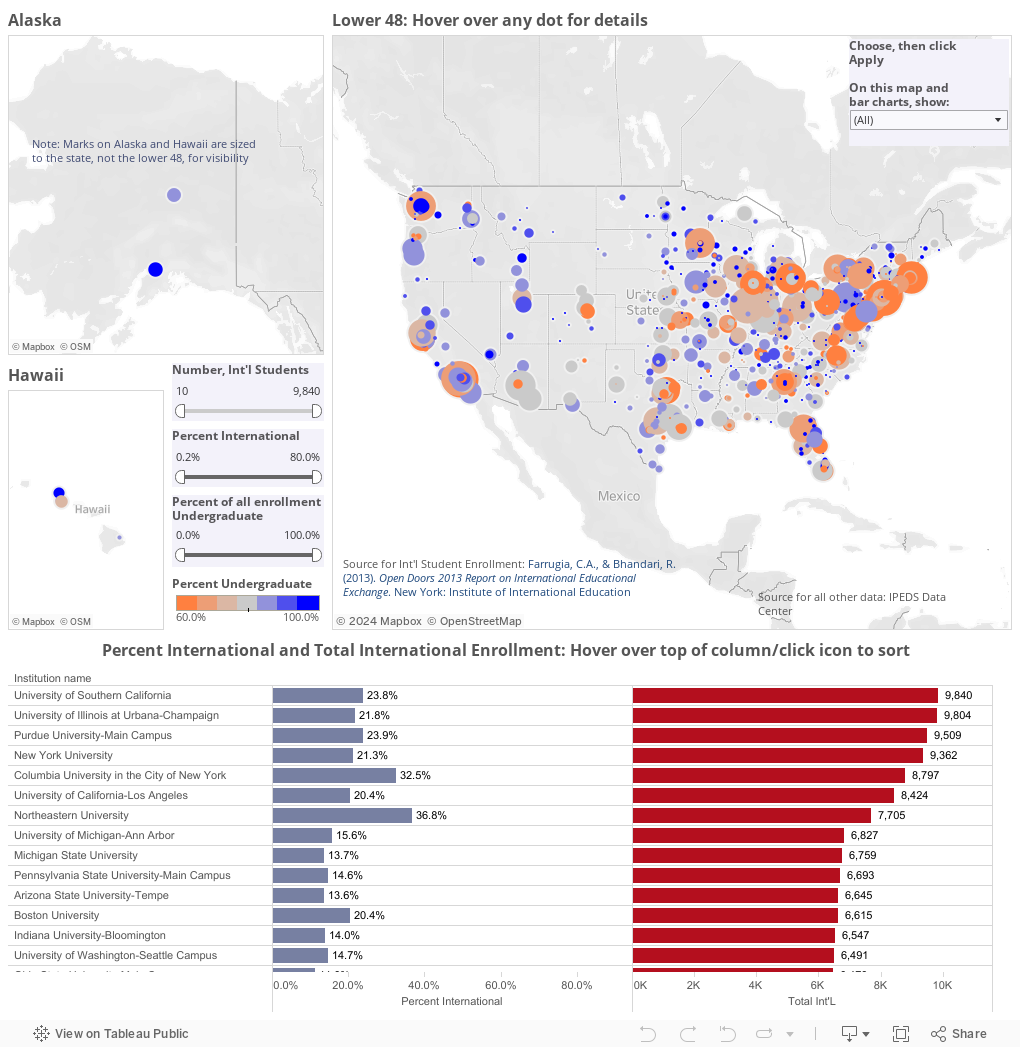
Each dot on the map represents a college or university (hover over for details). The size of the dot represents the International Student population in 2012, and the color represents the percentage of enrollment at that college or university that is international (that is, on a J-1 or F-1 Visa, presumably; permanent residents are not considered international students.) The bar charts below show every IHE with both the number of international students (right column) and percentage of all enrollment that is international (on the left.)
You can use the filters to narrow down the IHEs displayed, by choosing the number of international students, the percent international, or the percent of all enrollment that is international. And you can sort the bar charts by hovering over the small icon that appears when you hover over the top of the bar chart. Clicks cycle through displays. The circular arrow at the bottom resets it all.
Note: The IIE data does not break out enrollment by graduate/undergraduate, so I cannot calculate the percentage of undergrads or graduate students who are international. The only thing I can show is the total international population as a percentage of all students enrolled.
Comments
Post a Comment