
All Degrees Awarded by US Colleges and Universities, 2019

 The question often asked by high school and independent counselors is something like, "What college offers degrees in <insert major name>.  While this can't help you know what colleges offer a specific degree, it can tell you which colleges awarded those degrees in 2019.

It can also help you see the shape of degrees awarded in the US, and even dive deeper into a specific college to see what types of degrees 

It's pretty straight-forward, but there are also some features you need to be aware of.  If you know how to Tableau, go ahead and dive right in.

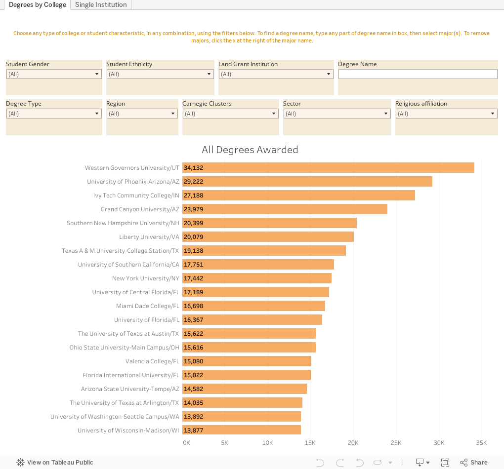
The first view using the tabs across the top shows all degrees awarded by US colleges in 2019.  From there, you can choose any specific combination of student and college characteristics: For instance, if you want to find which institutions award the most bachelor's degrees at public universities in the southwest, just click.  If you then want to find which of those colleges offer the most degrees in History, just start typing "history" in the box at upper right.

You'll see lots of options, including general history, military history, Asian history, and many others. Click the boxes to choose the ones you want.

If you make all those choices and select "General History" you'll see that UT-Austin leads the pack with 147.

To clear the degree name, click the X to the right of it in the filter.

The second view starts with the high-level overview.  Choose a single institution by typing any part of the name in the Institution Name box.  It works just like the major box on the first view.  Once you have that college selected, you can filter further by clicking on a bar in any of the other charts.  Give it a try; clear by clicking on white space.

As always, let me know what you find.


Comments

Popular posts from this blog

The Highly Rejective Colleges

If you're not following Akil Bello on Twitter, you should be.  His timeline is filled with great insights about standardized testing, and he takes great effort to point out racism (both subtle and not-so-subtle) in higher education, all while throwing in references to the Knicks and his daughter Enid, making the experience interesting, compelling, and sometimes, fun. Recently, he created the term " highly rejective colleges " as a more apt description for what are otherwise called "highly selective colleges."  As I've said before, a college that admits 15% of applicants really has a rejections office, not an admissions office.  The term appears to have taken off on Twitter, and I hope it will stick. So I took a look at the highly rejectives (really, that's all I'm going to call them from now on) and found some interesting patterns in the data. Take a look:  The 1,132 four-year, private colleges and universities with admissions data in IPEDS are incl

Yes, your yield rate is still falling, redux (2021)

I've been creating this data visualization, or some form of it, for several years now .  I think it's most useful for higher education enrollment professionals who have to explain to people at their university why their yield rate is falling.  The short answer is that applications and admits are increasing faster than student populations: If a student today applies to an average of seven colleges, compared to four colleges twenty years ago, yield rate almost has to go down.  I'm sure AI will fix this, and all our problems, very soon. But I've spoken to others who use this other ways: To work with students to talk about chances for admission; to show parents how things have changed in the past twenty years; or to help journalists understand the lay of the land.  Whatever you use this for, I hope it's instructive, and I hope you feel free to share it widely. And if you work in a college or university and save yourself some time by using this, or if you work with clien

Freshman Migration, 1986 to 2020

(Note: I discovered that in IPEDS, Penn State Main Campus now reports with "The Pennsylvania State University" as one system.  So when you'd look at things over time, Penn State would have data until 2018, and then The Penn....etc would show up in 2020.  I found out Penn State main campus still reports its own data on the website, so I went there, and edited the IPEDS data by hand.  So if you noticed that error, it should be corrected now, but I'm not sure what I'll do in years going forward.) Freshman migration to and from the states is always a favorite visualization of mine, both because I find it a compelling and interesting topic, and because I had a few breakthroughs with calculated variables the first time I tried to do it. If you're a loyal reader, you know what this shows: The number of freshman and their movement between the states.  And if you're a loyal viewer and you use this for your work in your business, please consider supporting the costs